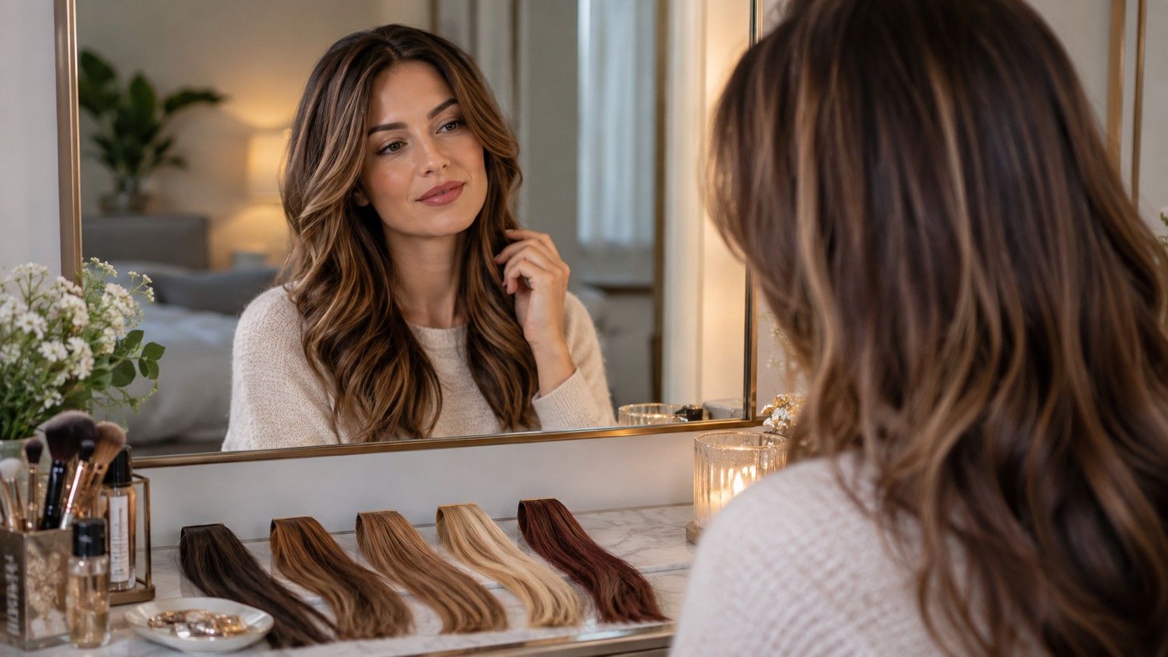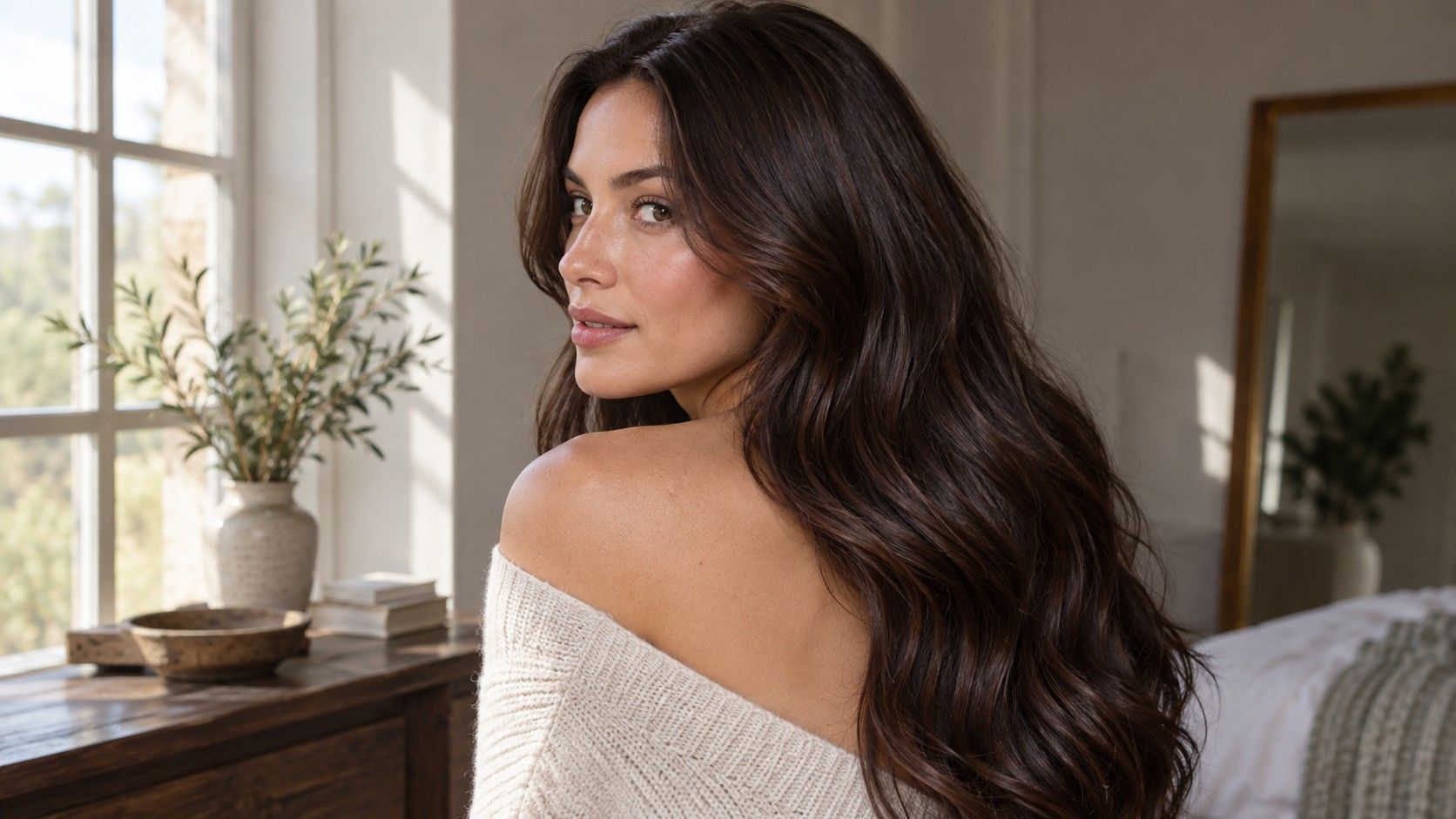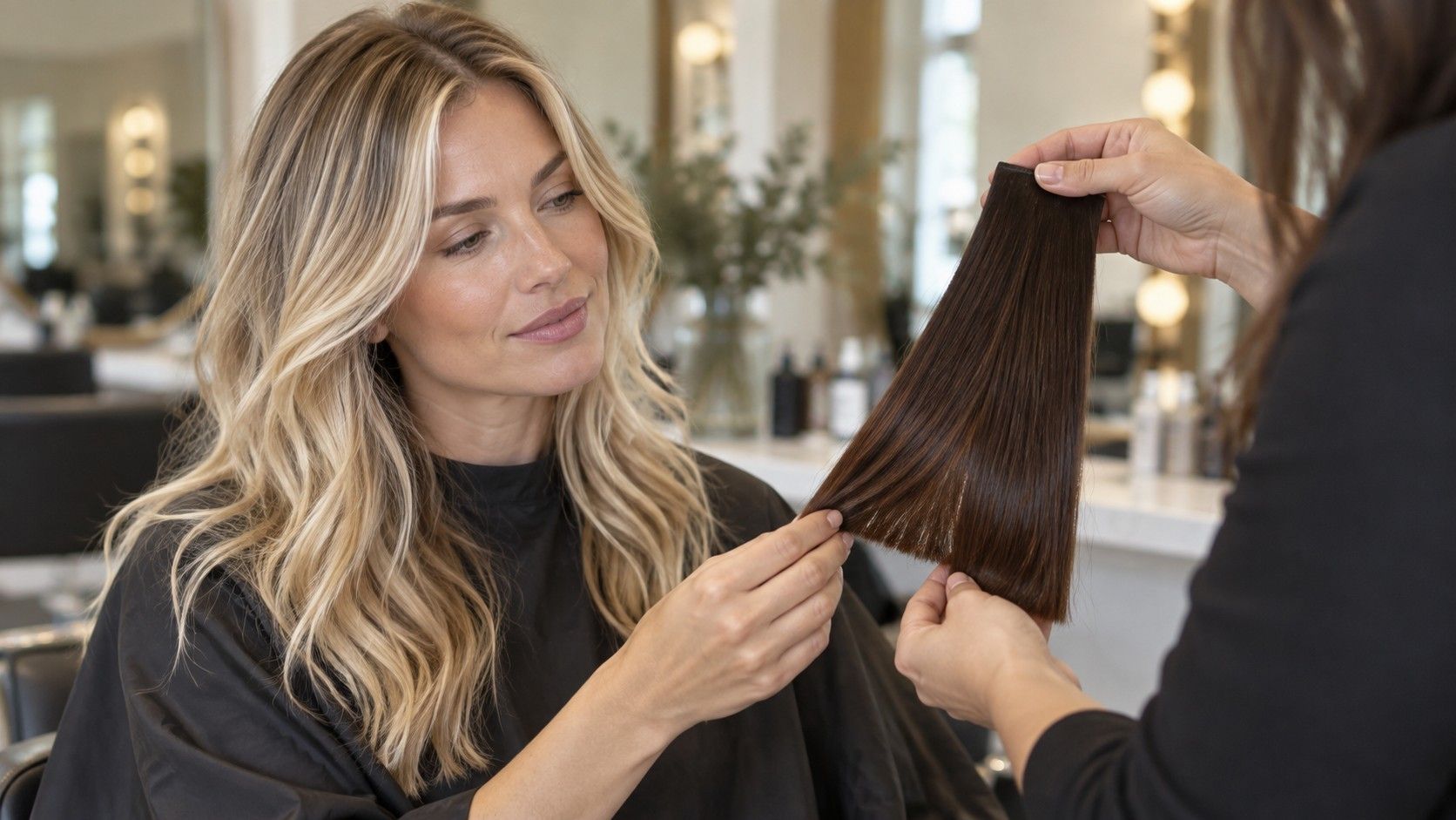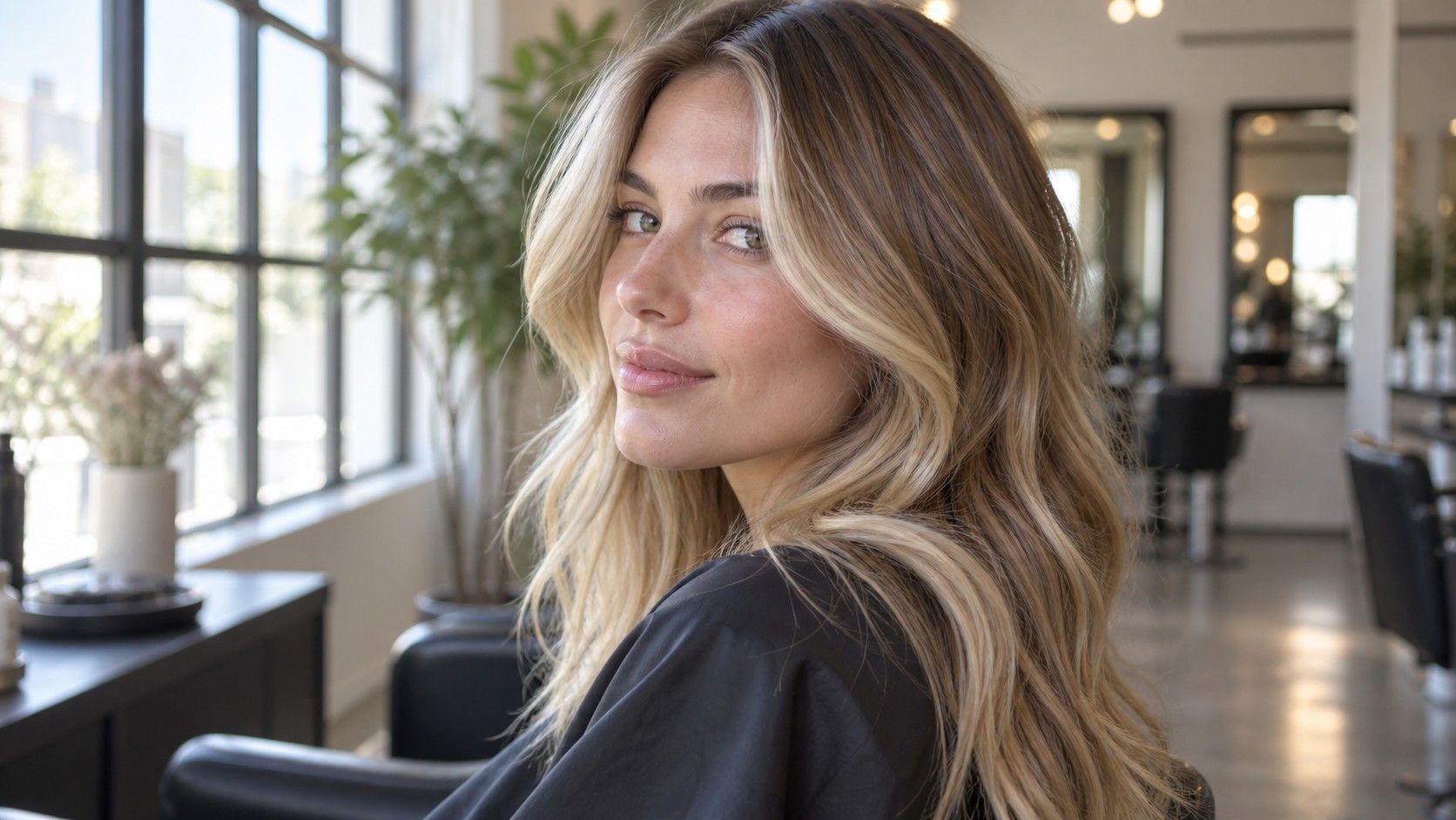
A highlights preview is most useful when it answers more than “Do I like blonde?” Two images can use a similar light tone yet create completely different results because the brighter strands begin in different places, use different widths, and leave different amounts of the base color visible. Digital previews cannot promise exact strand-by-strand placement, but they can help you decide where you want attention, how much contrast feels comfortable, and which details need to be discussed before any color service begins.
Check whether the preview changes strands or the whole head
Some effects labeled as highlights simply brighten the entire hair shape and add a few pale streaks on top. That can be attractive, but it does not show the same decision as selective lightening. In a convincing strand-based preview, areas of the original base should remain visible between lighter ribbons, especially beneath the crown, behind the ears, and through interior lengths.
Start with the parting you actually wear
Compare the roots with the ends. If every pixel becomes lighter from scalp to tip, you are viewing a broad color change rather than useful highlight placement. If the brightness follows a few sections while the underlying depth remains, the image offers more information about contrast. Wispy edges around the face may be imperfect; focus on the pattern across larger areas instead of treating a clean digital boundary as a technical promise.
It helps to save the unchanged photograph beside every result. The original reveals how much of the visual lift comes from actual lighter strands and how much comes from altered exposure or skin tone. If the face, background, and shirt all become brighter, the apparent blonde effect has been exaggerated by the whole image.
When trying on highlights virtually, the most revealing question is how much base color survives. A brunette can remain recognizably brunette with bright accents, or become blonde overall with darker pieces between them. Both can be valid goals, but they lead to different maintenance, different regrowth, and potentially different work on previously colored hair.
Highlight placement is organized around the way hair falls. A center part exposes two root lines and makes symmetry easy to see. A deep side part concentrates more hair on one side, so a balanced pattern in a center-part preview may look uneven when moved. A fringe creates its own foreground and can hide or interrupt pieces designed to frame an open forehead.
Use a source photograph with your normal part, not the part that best displays the effect. Show enough of the crown to judge root spacing. Highlights that begin close to the scalp create brightness immediately but can reveal a clearer line as natural hair grows. Pieces that begin slightly away from the scalp look softer at the root and may preserve more depth, although the preview should not be mistaken for an exact measurement.
Then imagine an ordinary week rather than one finished photograph. If you alternate between a center and side part, inspect both orientations. If the hair is often tucked behind one ear, notice whether that removes the brightest face-framing piece from view. If curls shift the part from day to day, a rigid pair of symmetrical ribbons may matter less than a dispersed pattern.
Root spacing also changes the apparent size of the head of color. Brightness starting at the scalp reads as a more complete transformation. A deeper root keeps the starting color present and can make the light pieces appear more dimensional. Neither is inherently better; the useful preview is the one that matches how you actually style and how sharply you want regrowth to appear.
Compare a bright front piece with softer ribbons
A money piece places a noticeable amount of brightness near the front hairline. In a preview of face-framing highlights, it may look crisp and graphic when the front sections are broad and several levels lighter than the base. Softer ribbons use narrower sections, smaller jumps in depth, or both. The distinction matters more than whether the blonde is called beige, honey, or ash.
Make two versions at a similar tone: one with a strong front piece and one with distributed fine brightness. Look first at the temples and jaw. A wide pale section creates a deliberate border around the face and remains conspicuous when the rest of the hair moves back. Fine ribbons blend with the base and reveal themselves more through motion. If you like the first image only because the styling places both front strands perfectly, test what happens when one is tucked away.
Ribbon width changes the visual rhythm through the lengths. Broad sections form clear bands, particularly on straight or softly waved hair. Narrow sections create a speckled or diffused effect, depending on how much base remains. Strong contrast makes either pattern more obvious. A narrow very-light ribbon on a dark base can read more sharply than a wider ribbon just slightly lighter than the base.
| Preview choice | Visual effect | Useful check |
|---|---|---|
| Bright front piece | Strong focus at hairline and cheeks | View with one side tucked back |
| Fine face-framing ribbons | Softer movement around the face | Check whether they remain visible at normal size |
| Distributed partial highlights | Brightness across the visible top layer | Compare crown, sides, and base left underneath |
A digital effect may draw identical stripes on both sides or place light over flyaway hairs that would not form one color section. Read the arrangement as a preference map: bolder or softer at the front, wider or finer ribbons, higher or lower contrast. Leave the exact sectioning to a consultation based on density, texture, haircut, and color history.
Look at the base color left between highlights
The darker spaces are not empty background. They determine whether highlights look connected, striped, smoky, sunlit, or very high contrast. When a preview makes every surface strand pale, the result loses much of the depth that created dimension in the first place. When it leaves too much uninterrupted base, the effect may disappear except in bright light.
Inspect three zones separately: the visible crown, the mid-lengths beside the face, and the ends. A partial highlights preview may brighten the top while leaving a deeper underside. That difference becomes obvious when hair moves, goes into a ponytail, or sits over the shoulders. An image taken only from the front cannot fully describe the back, but it can reveal whether you want the visible surface mostly light or visibly mixed.
Contrast is a relationship between the base and the lighter pieces. Beige blonde on light brown hair may appear quiet; the same blonde on very dark brown may form defined stripes. If you change the highlight tone and base at the same time, you cannot tell which relationship you prefer. Keep the starting base constant for the first comparison, then test whether a softened or shadowed root changes the balance.
Previously dyed lengths deserve special caution. A preview may place clean pale ribbons over dark artificial color without showing the difficulty, unevenness, or condition concerns that can affect a real service. It is better to use that image to describe the desired distribution than to assume the displayed lightness is available in one appointment. Hair history and a professional assessment determine what is practical.
Also preview the hair worn up if that is common for you. A ponytail exposes the hairline and underside, areas a front-facing effect may barely alter. Strong brightness on top with a dark lower hairline can be a deliberate dimensional look; it simply should not be a surprise discovered after the first high ponytail.
Bring placement references instead of a single blonde label
Words such as blonde, balayage, and highlights cover too many visual arrangements to carry the decision alone. A useful reference set contains two or three images with notes about placement. One can show the preferred front brightness, another the amount of base left through the crown, and a third the ribbon width through the lengths. The images do not need identical tones if each has a clearly stated purpose.
Describe relationships rather than promising a replica: brighter around the face but not a solid pale panel; fine pieces at the part with more depth underneath; a soft root rather than lightness starting uniformly at the scalp. Mention how the hair is usually parted and whether it is commonly worn straight, curly, tucked back, or tied up. These details change which sections are visible in daily life.
It is equally useful to save one reference that shows too much. Mark whether the problem is the width, the closeness to the root, the total blonde coverage, or the contrast against the base. “Not this bright at the front” is more precise than “natural-looking,” a phrase that means different things to different people.
During a consultation, compare those placement preferences with current density, texture, haircut, previous color, and tolerance for upkeep. Fine hair may display the base differently from dense hair; curls can break up straight bands; a layered cut moves the endpoints of bright ribbons. None of that makes a preview pointless. It explains its proper role: a clear visual draft of where brightness should be noticed, not a guaranteed map of individual strands.
The strongest preview is therefore not automatically the blondest one. It is the version in which the part, front pieces, surviving base, and likely regrowth all support the same idea. Once those relationships are clear, choosing the exact blonde tone becomes a narrower and more useful conversation.