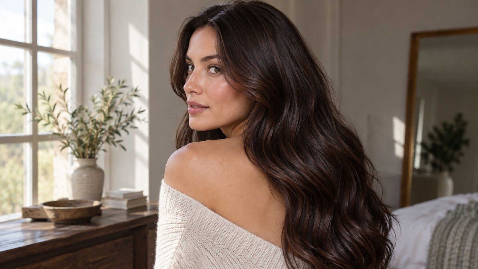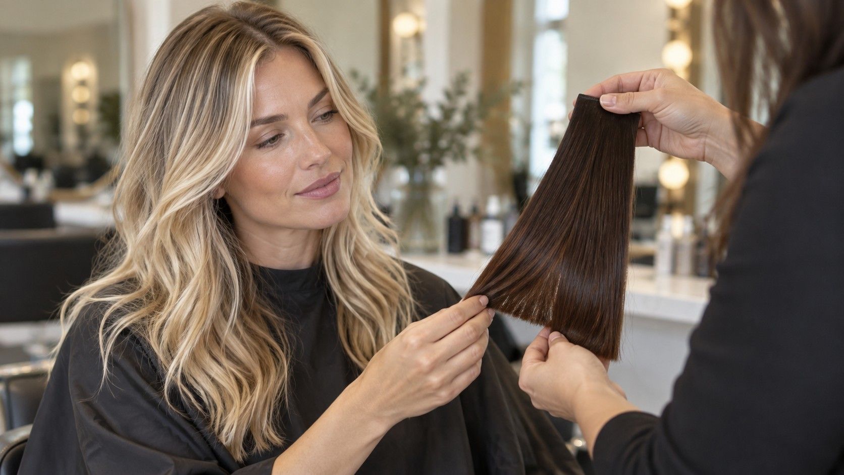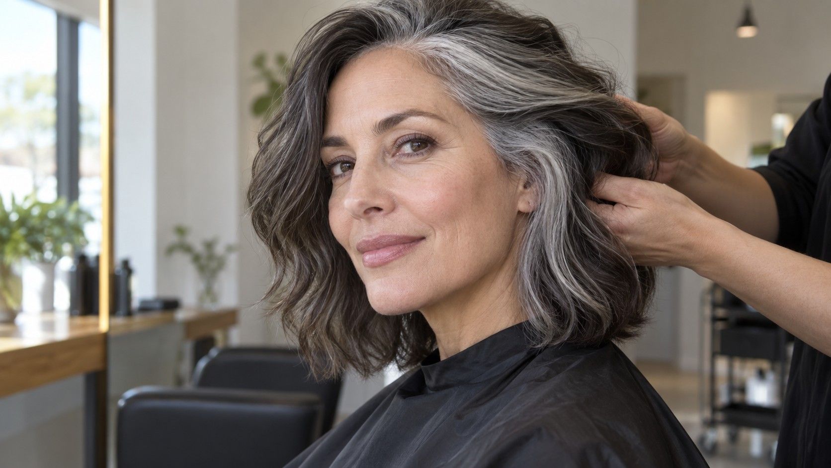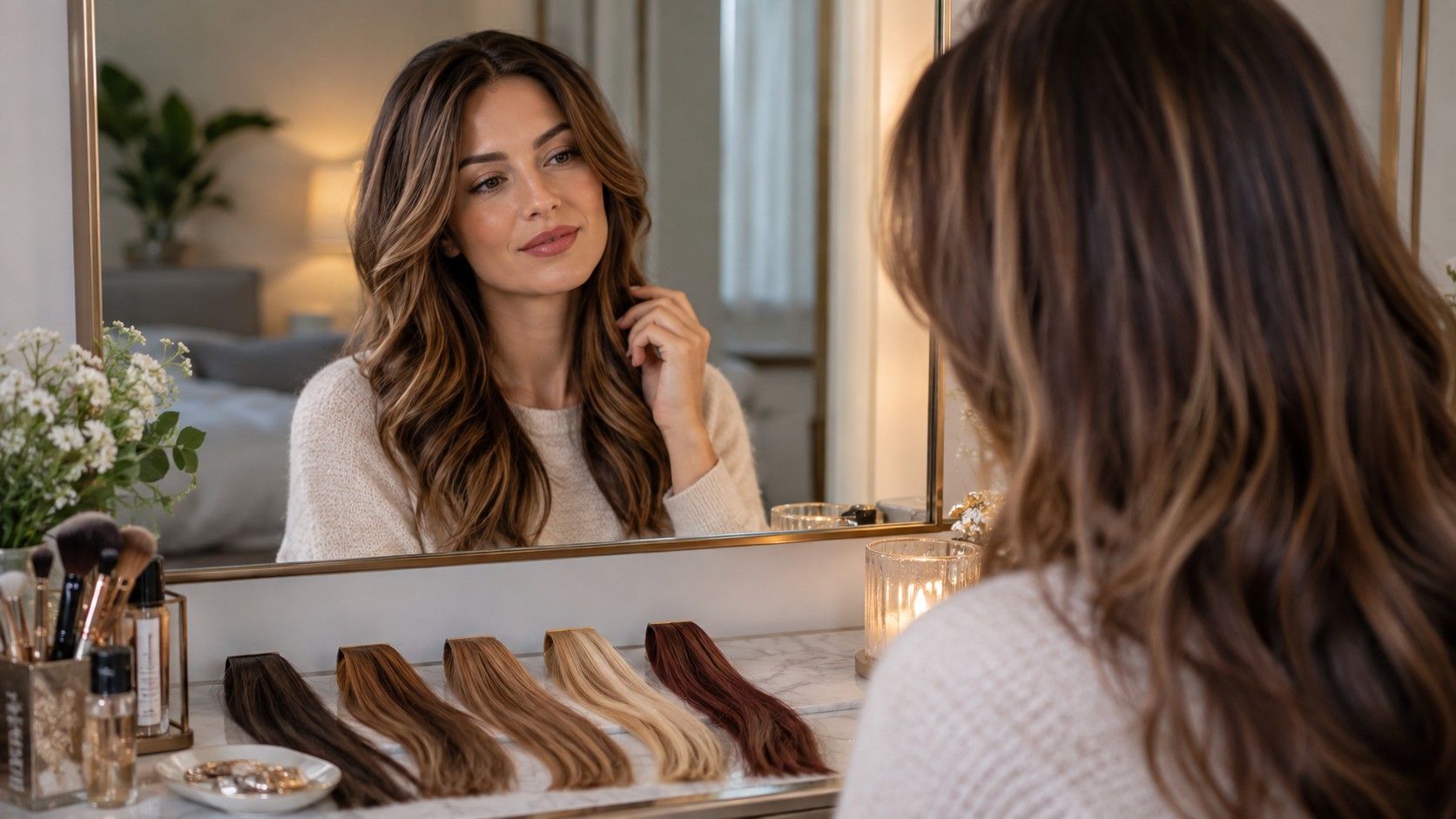
A row of convincing previews can make a decision harder, not easier. Rich brown, soft copper, beige blonde, and near-black may each suit a different version of the same photograph. The useful question is not which image looks most polished. It is which color still makes sense when the lighting, starting hair, roots, fading, and maintenance are brought back into the picture. A disciplined side-by-side comparison turns a gallery of appealing options into a shortlist you can actually discuss and live with.
Keep one photograph and change one color variable
The cleanest comparison begins with a constant source photograph. Use the same face, crop, expression, hairstyle, and background for every hair color preview. If one version uses loose waves in window light and another uses a sleek style under a warm lamp, you are partly judging texture and photography. Even a small crop change can make a dark shade appear more dramatic because it fills more of the frame.
Compare depth before fine-tuning warmth
Choose a photograph in neutral daylight when possible, with the full hairline and enough length visible to show how color occupies the shape. Hair pulled tightly behind the ears hides the area where a shade meets the face. Heavy shadow removes dimension, while direct sun can turn ordinary warmth into a bright gold or red cast. The photograph need not be perfect; it only needs to remain constant throughout the test.
Then change one variable at a time. Compare medium neutral brown with dark neutral brown before comparing medium brown with strawberry blonde. Or hold the depth steady and move from cool brown to neutral brown to warm brown. When both depth and warmth change at once, it becomes difficult to explain what you prefer. You may think you like copper when the real attraction is simply that the copper preview is lighter than the brunette one.
Keep the same crop when saving results, and name each image in plain terms rather than flattering labels. “Level darker, neutral” is more useful later than “moody espresso.” The goal is not to reproduce a salon numbering system from a screen. It is to preserve the distinction you were actually comparing.
Depth has the strongest effect on the overall visual weight of hair. A darker preview can sharpen the border between hair and skin, make the eyebrows seem lighter, and give a haircut a denser outline. A lighter preview reduces that border and may reveal more movement through the lengths. Those changes remain visible even when a digital color is not perfectly realistic, which makes depth a sensible first filter.
Make a first row with three depths in roughly the same color family: for example, dark brown, medium brown, and light brown. Look at the hairline, the space beside the cheeks, and the balance between hair and eyebrows. Do not decide from the glossy center of the hair alone. If the darkest option seems to sit on top of the face rather than around it, compare one step lighter. If the lightest option makes the hair appear disconnected from strong brows or a naturally dark root, bring some depth back.
Only after choosing a workable depth should you compare warmth. Put a cool, neutral, and warm version of that depth beside one another. Warmth is easiest to judge near the forehead and jaw, where reflected color can make skin look livelier in one rendering and unusually pink, yellow, or gray in another. Treat extreme skin changes with suspicion: some previews tint the surrounding photograph as well as the hair.
| Comparison round | Keep constant | Change | What to inspect |
|---|---|---|---|
| Depth | Color family and photograph | Light, medium, dark | Hairline weight, brows, overall contrast |
| Warmth | Chosen depth | Cool, neutral, warm | Reflection near forehead, cheeks, and jaw |
| Finish | Depth and warmth | Solid, dimensional, highlighted | Movement, root softness, visible upkeep |
This order also produces clearer language. “Medium depth with restrained warmth” gives a colorist more information than “the third picture.” It separates the visual destination from the name a filter happened to assign it.
Reduce the shortlist to three genuinely different options
Saving twelve neighboring shades feels thorough, but it usually preserves uncertainty. A useful shade shortlist contains three options that answer different priorities. One might stay close to the starting hair color, one might offer a noticeable but manageable change, and one might be the ambitious choice. If two previews differ only by a barely visible tint, keep the one that looks convincing in more than one viewing condition.
Review saved images at two sizes. At thumbnail size, notice overall balance and whether the hair dominates the portrait. At a larger size, inspect the hairline, part, ears, and wispy strands. Digital color commonly looks strongest across broad smooth areas and weakest around transparent edges. A shade should not win merely because the renderer produced cleaner edges for that option.
Leave the comparison for a few hours and return without the shade names in view. Novelty has a strong first-day advantage: the biggest change often feels exciting because it is unfamiliar. On a second look, the quiet option may seem more coherent, or the dramatic option may still have the pull you hoped for. Either result is useful. The pause tests preference rather than technical accuracy.
Ask one practical question of each finalist. Does the closest option feel different enough to justify coloring? Does the middle option preserve enough connection to the natural root? Does the ambitious option require lightening, frequent toning, or a degree of contrast you would tire of? These are not reasons to reject change. They reveal what each attractive picture is asking from the real hair.
Picture the roots and the faded version
A virtual preview normally shows the color on day one, with no regrowth and an even finish from root to end. Real color immediately starts moving away from that moment. To compare hair colors side by side honestly, imagine two additional states: several weeks of natural root and a softer, less intense version through the lengths.
Begin with your actual starting hair color. A dark natural root against a light preview creates a visible line unless the plan includes shadowing, highlights, or another blended transition. A lighter natural root under a very dark shade may show as a pale band sooner than expected. Gray or white strands can create a third kind of contrast because they reflect light differently and may not disappear into a solid digital overlay.
Look at the part and temples, not only the ends. These are the areas where regrowth tends to be noticed first. If a preview only feels successful when color reaches the scalp with perfect uniformity, it may imply more frequent maintenance than a version with a softer root. A dimensional brunette close to the starting depth may age more quietly than a single dark block. A blonde with varied ribbons may tolerate new growth better than an evenly bright root, depending on the existing base and placement.
Now mentally lower the saturation. Reds and coppers may become softer or shift in emphasis between appointments; cool-looking tones can lose their freshly toned appearance; very dark color may reveal warmer-looking areas under certain light. The exact change depends on hair history, products, water, sun exposure, and service, so a preview cannot forecast it. It can still help you decide whether you like only the most polished version or the broader color family.
Maintenance is part of appearance. If you prefer a preview only with a perfectly cool finish and no root contrast, say so before choosing it. If you would accept a warmer fade and visible root, that flexibility widens the realistic options.
Turn the winning preview into a useful salon reference
A single image should open a conversation, not function as a formula. Save the winning preview along with the two alternatives and note what changed between them. Point out the chosen depth, the amount of warmth, how solid or dimensional the result appears, and how much natural root you want to keep. Also mark anything you do not want, such as a black-looking outline, bright orange warmth, or a pale band around the face.
Bring a current photograph of your starting hair in ordinary daylight as well. Existing artificial color, previous lightening, gray coverage, porosity, and damage can limit which route is sensible. A visual target does not show what is already inside the lengths or how evenly they may lift. That assessment belongs to the real consultation and, where appropriate, strand testing.
Use relative language when the screen is uncertain. “One level lighter than my current lengths, with gentle warmth and a softer root” travels better between devices than a precise shade name sampled from a display. Screens, filters, and indoor lighting can all shift color. Describe the relationship you want: deeper or lighter, warmer or cooler, solid or dimensional, high or low root contrast.
The best side-by-side comparison therefore ends with two decisions. The first is visual: which family and depth support the face and haircut? The second is practical: which version can be approached from the starting hair with acceptable upkeep? When both answers point toward the same preview, the image has done its job.